Week 6: Clean slate and cleaner team

This week was a bit of an odd one.
We entered for our weekly feedback session with our nearly finished prototype from week 05. Somewhere during that session we received a new team member, Yannick! From now on we'll be rocking a team of 5 with 3 artists and 2 programmers. Due to the scope and time of the project we'll have to integrate him relatively quickly. This will be an interesting endeavour to say the least. Since we didn't have a model yet for our overlord character this seemed like the perfect solution to get him to understand our art style without having to do menial tasks.
Development
---------------------------
Robin:
As for the programming aspect of the the project, we've been granted permission to enter development. This means ditching all the bad code we have right now and keep the spicy good stuff to build on. There's a lot of bad stuff. Not so much on the spicy side.
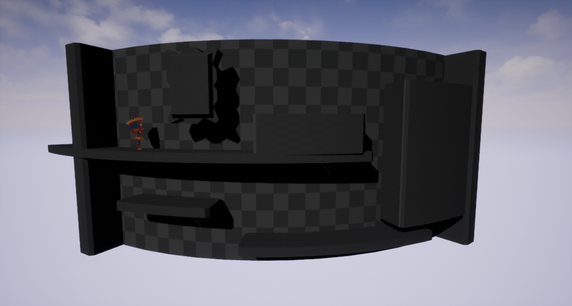
Some choices we made this week as well is how the different sides of the tower are going to work. We knew the tower discs should have several sides that can be active and playable, but not how many, how tall, how wide, how everything they should be.
We played around with a model and a character for size reference and came to a reasonable solution. The tower will be split up into 3 different sides which are not fully accessible. This means that between the active play area will be a gray zone which the players will be able to traverse when the disc is rotating. This allows us to make a slightly bigger tower, design interesting levels and still have plenty of room for the players to move.
Having a wider tower with dead zones the players cant enter also fixes an issue we thought of with the camera being that the view would be very distorted when players are walking on the side of the active area.
Codewise we're actually a few steps back compared to the prototype but this should me fixed this week, taking into consideration the fact that we'll be implementing many more features soon enough.
Florian:
this week was all about transfering over from prototyping to production. We took what worked from the protorype and finetuned it
to put in production. We took some time to discuss how we were going to do things dev wise which really helped because we had to eliminate all the time we needed to "merge" the two dev works. If we both knew what was going on we could save a lot of time.
First I went to work on the camera because that was still something that needed to be done in prototyping and is quite essential to the game.
It needed a zoom functionality so that when two players go too far apart the camera would zoom out to keep them both visible in the
viewport.
I think I got this done however I could not test yet because i still needed the overlord to work to be able to take all the actors in to account to calculate height and distance.
Secondly I brought over the Game mode, Player controller and Trap blueprints over from prototype to production. I did some optimalisation
but more importantly since we were going to use Robins implementations I learned how exactly they worked so I will have an easier time
working with them in the future.
Art
-------------
Maximiliaan:
After reviewing our painted texture pipeline, we started having doubts about how viable it was to paint every prop uniquely, even with an extra artist in our team.
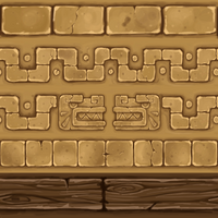
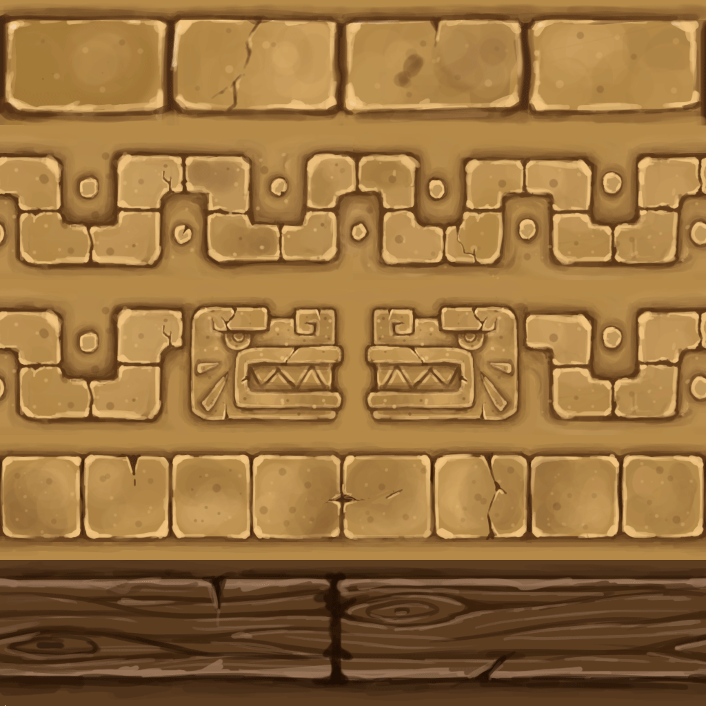
So we decided to try out a trim texturing approach. This will drastically speed up our workflow since we wouldn't have to paint each brick or plank again and again, but instead we would just have to unwrap edges to use trims/details and use big tiling textures for big surfaces.
the trim texture is a work in progress:
Paulien:
The artists mostly focused on getting our dimensions for all the platforms and blocks correct. This is what I worked on when we met up on Friday. As said before, we agreed our discs would be divided into 3 segments, where the transition between two segments would be a grey area that could only be traversed when that disc is rotating. This is to prevent distortion because of characters being able to walk on the side of the tower. This grey area would be made clear by a force field. When then figured out our dimensions for the platforms in width and in height: we have one small platform, a medium platform twice the size of the small one and a large platform twice the size of the medium one. We did a similar thing for the blocks and walls. I made it so the pivot point would be the center of the tower so it would make it easy to get the placement of everything correct more easily.
I also worked a bit on my particles from last week to make them look a bit nicer, chamfered the platforms a bit to make them more stylized, and modeled and started texturing a crushing block.
Yannick:
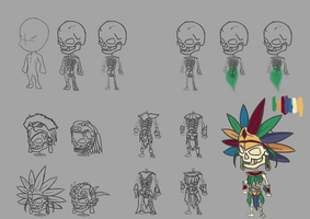
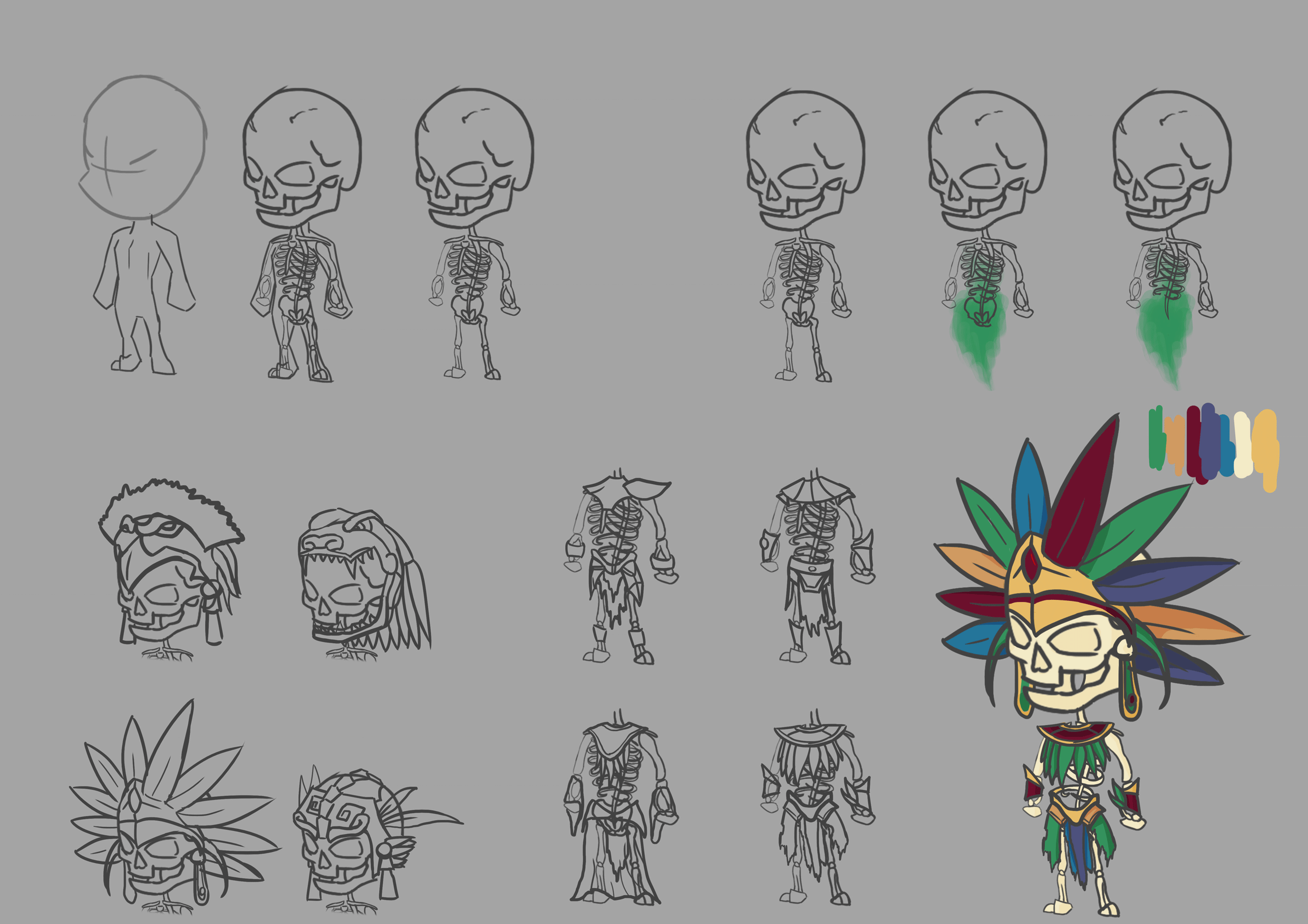
for this week i worked on the concept of the overlord, basing him on the Mayan god of death. The most difficult part of this was making a character like that fit in a cartoony setting. In the end it definitely fits the style (in my opinion), this means i can start modeling it.
Files
Get [Group 8] Sacrifumble
[Group 8] Sacrifumble
Platformer mayhem with a spin
| Status | Released |
| Authors | PaulienCasteleyn, Robin Strubbe, MaximiliaanMaene, FlorianGaeremynck, yannickM |
| Genre | Platformer |
| Tags | Arcade, aztec, cartoony, Colorful, Controller, Local Co-Op, Local multiplayer, Skeletons, suspense |
| Languages | English |
More posts
- All good things come to an endJun 04, 2018
- Week12: The finish lineMay 23, 2018
- Week11: Make it look shinyMay 16, 2018
- Week10: Tower 2.0May 08, 2018
- Week 9: Prepare for take-offApr 24, 2018
- Week 8: Easter EggsApr 17, 2018
- Week 7: Game with a spinMar 27, 2018
- Week 5: finishing up prototype and preparing HacknPlanMar 14, 2018
- Week 4: prototyping and 3D art shenanigansMar 06, 2018
![[Group 8] Sacrifumble](https://img.itch.zone/aW1nLzEyNzU4NDYucG5n/original/AwVoOT.png)
Leave a comment
Log in with itch.io to leave a comment.