Week12: The finish line


After 12 long weeks of scrums, design discussions, meetings, bugs, crashes, blood, sweat and tears we have almost reached the end. However the last week of polish was no less important than the first week of prototyping so lets dive straight in and see what we got done with the deadline right in front of us.
Florian:
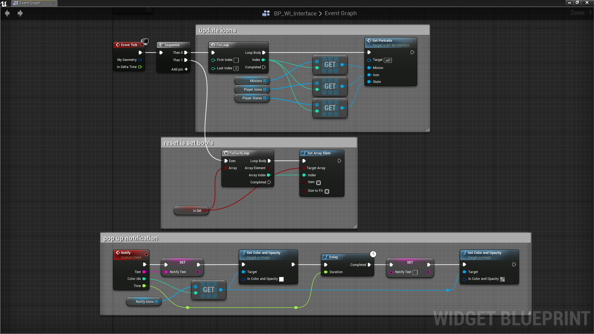
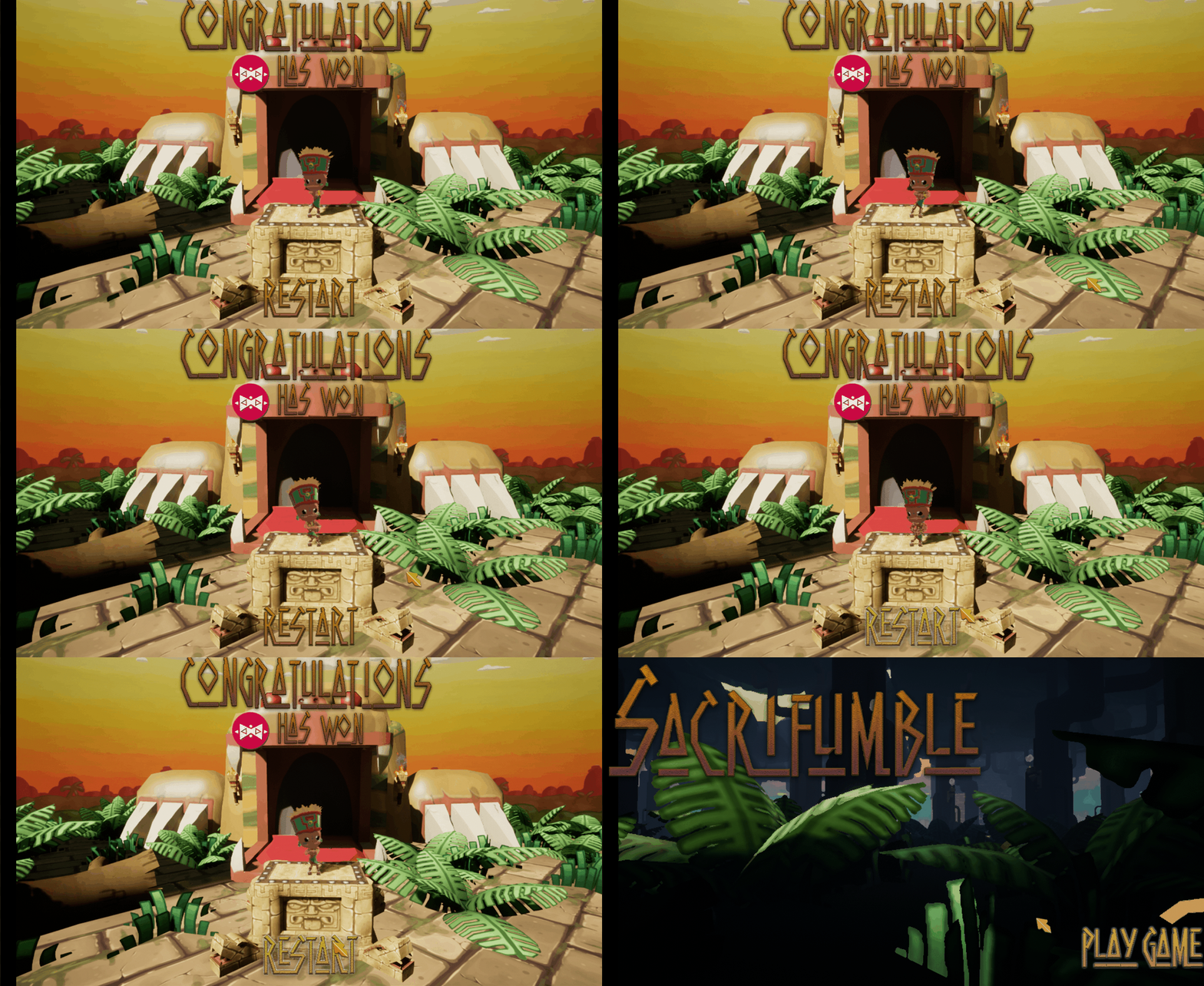
Another week of UI work and bug fixes. I got a lot of different things done from transfering information from one scene to the other to solve an issue with the UI of the end screen to figuring out how to put UI images in arrays in unreal so i could make my widget code a lot cleaner and easier to maintain. I also added a custom event to the UI widget that everyone could use to notify all players of something and as a proof of concept I used it for things like notifying everyone if somebody had become overlord and if a player joined the game. But apart from just UI stuff I also helped out with some animation work, again making code more clean and easy to maintain by in stead of using a lot of different booleans for animations I introduced an enumerator but that's rather minor.

Yannick:
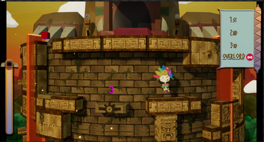
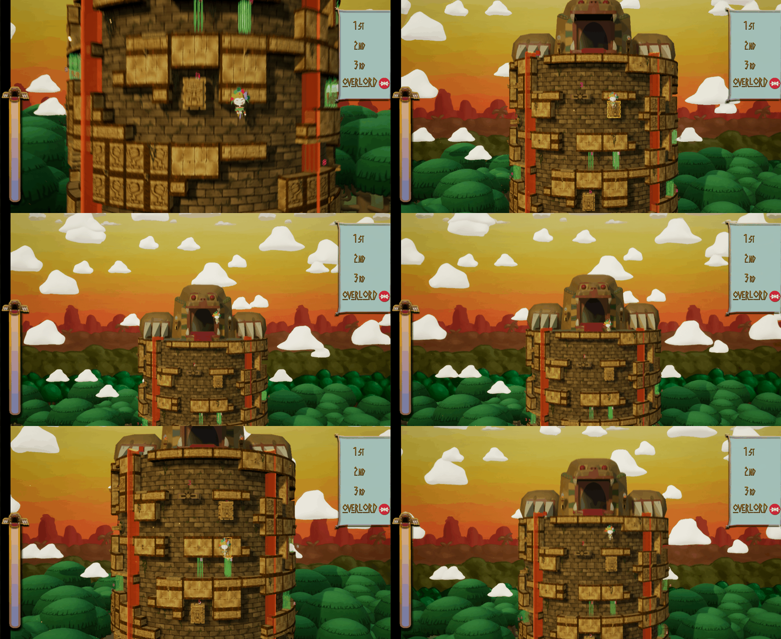
this week i started by working on livening up the tower by using object we made earlier like the scones/torches and vines. this was my most important task. i'm also working at updating the end texture but because it's such a complex object it's very difficult to make it fit more with the background. after this i only have a couple of small tasks to do.
Paulien:
This week everything had to be finished so I wanted to make sure my work was done as well as possible. I spent a lot of time working on the parallax scrolling background to make it work vertically and look believable, I also made sure it didn't move when zooming out and Robin helped a bit to make it work so that it moves up when the camera moves up and the other way around. I made some adjustments to the forcefield so it is now only one mesh and so it isn't too distracting by only making the sparks and lightning show up when someone hits it. This way it wouldn't seem like you can die when walking against the forcefield.

I then reworked all the UI elements: I used a new font which I found for everything and adjusted this a bit so it would work better with our theme. I added quite some stuff to the start and end game levels so it would look a bit fuller and better. I also made the minions and overlord in the start game level loop. I adjusted the UI elements in the main level so it would work better with the game and used the new font for the placement as well. I then adjusted the fireflies so they would actually be visible in the game.


Robin:
This last week was amazing. I got to spend loads of time making sound effects, which mostly turned out pretty decent if I do say so myself. While things might have gone faster if I went with some default sound effects without editing, they would in no way have the same feel as the combined ones.
Working with unreal audio nodes is pretty interesting. I barely scratched the surface yet feel like I've learned so incredibly much.
The background music isn't quite what we were hoping for for the game but sadly making music is slightly out of the scope of this project.
Files
Get [Group 8] Sacrifumble
[Group 8] Sacrifumble
Platformer mayhem with a spin
| Status | Released |
| Authors | PaulienCasteleyn, Robin Strubbe, MaximiliaanMaene, FlorianGaeremynck, yannickM |
| Genre | Platformer |
| Tags | Arcade, aztec, cartoony, Colorful, Controller, Local Co-Op, Local multiplayer, Skeletons, suspense |
| Languages | English |
More posts
- All good things come to an endJun 04, 2018
- Week11: Make it look shinyMay 16, 2018
- Week10: Tower 2.0May 08, 2018
- Week 9: Prepare for take-offApr 24, 2018
- Week 8: Easter EggsApr 17, 2018
- Week 7: Game with a spinMar 27, 2018
- Week 6: Clean slate and cleaner teamMar 20, 2018
- Week 5: finishing up prototype and preparing HacknPlanMar 14, 2018
- Week 4: prototyping and 3D art shenanigansMar 06, 2018
![[Group 8] Sacrifumble](https://img.itch.zone/aW1nLzEyNzU4NDYucG5n/original/AwVoOT.png)
Leave a comment
Log in with itch.io to leave a comment.