Week10: Tower 2.0

Having to play test the game in front of a bunch of people and receiving people's feedback helps a lot. It gives new insights into how the game looks, feels and presents. The pdf we received contains a bunch of points we all worked on at this week.
Robin:
The last couple of days I spent most of my time completely remaking the level. Each disc now has a predefined exit and entrance on each of the possible active sides. This means that no matter how the tower is turned, an way to the top is always there. Using this I also noticed that occasionally I would like some more space when building discs/layers on the tower. Because of this I redid the way items are sensed inside the discs allowing me to link discs together and create larger, higher discs. This allows anyone working with the level to create more interesting levels/layers.
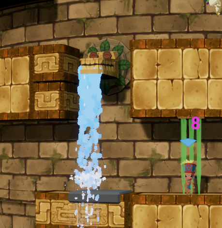
With some leftover time the implementation of the Tar and Water trap was suggested. These affect player movement when they walk through them. It took some messing about to get the speed of the minions to change correctly. Besides that figuring out the way particles collide with the minions was surprisingly tricky. In the end I used a bit of a workaround by by spawning some more blueprints that allow for overlap events.
Yannick:
This week I finished unwrapping and textured the end temple which now stands on top of the level. It definitely stands out being so big and with a very unique color scheme.
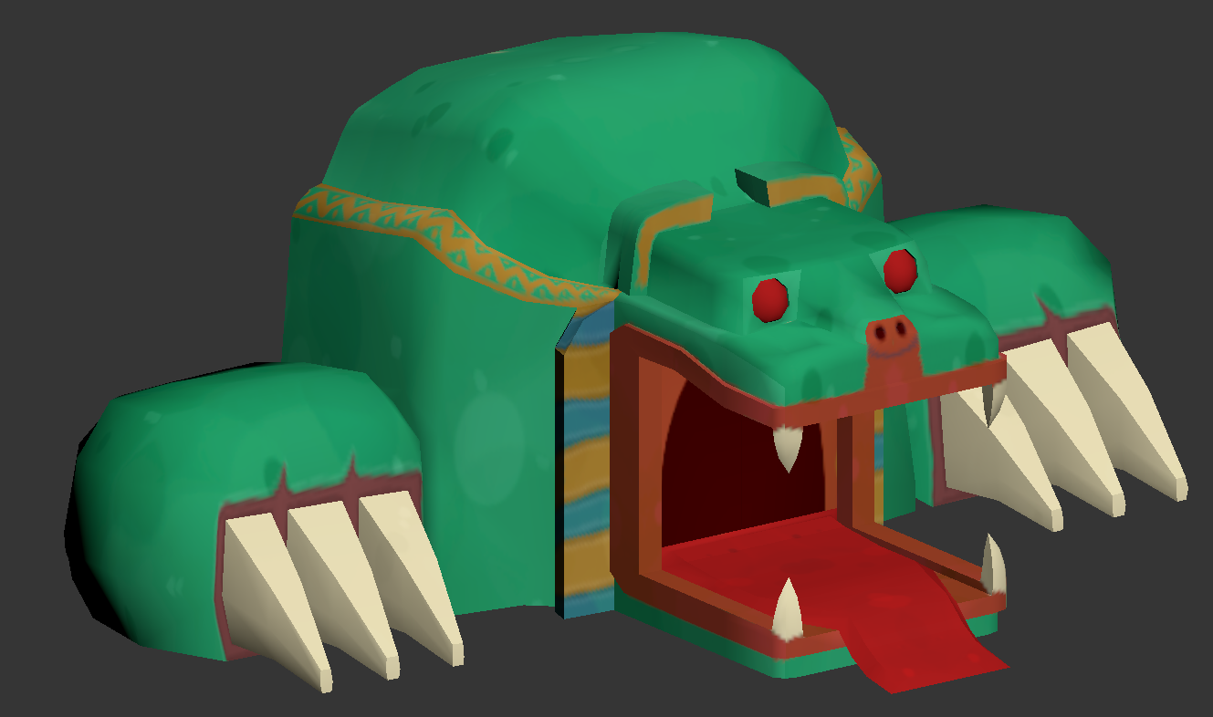
After that I textured the last untextured object in the level (as far as i know right now), the "lift". I had some trouble importing it into the level and in the end just decided to remake and unwrap it again. This turned out to fix the problems. I still don't know what the problem was but I hope it doesn't happen again.
Paulien:
For the last week of the last production sprint we finished our remaining tasks so we could go into the polish sprint. For me this meant making the particle effect for the fire trap and the tar trap.
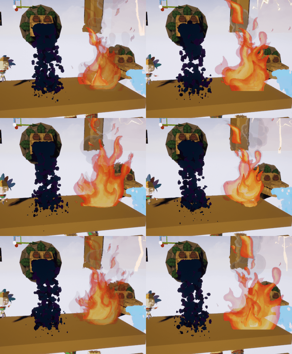
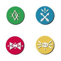
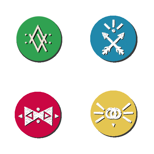
I also worked some more on the UI; I made an icon resembling the colour of each character and each icon has a different symbol on it. I also made the text for '__ has become Overlord' for the popup when the overlord changes.
I then finished the implementation of the overlord animations with some help from Maximiliaan.
Florian:
Did quite a lot in the last stretch before the polish sprint: the crushing blocks are no longer fancy environment pieces but working traps that flatten players upon impact. I also added a functional fire trap blueprint, should we decide to use it in the end it just needs some fancy particles.
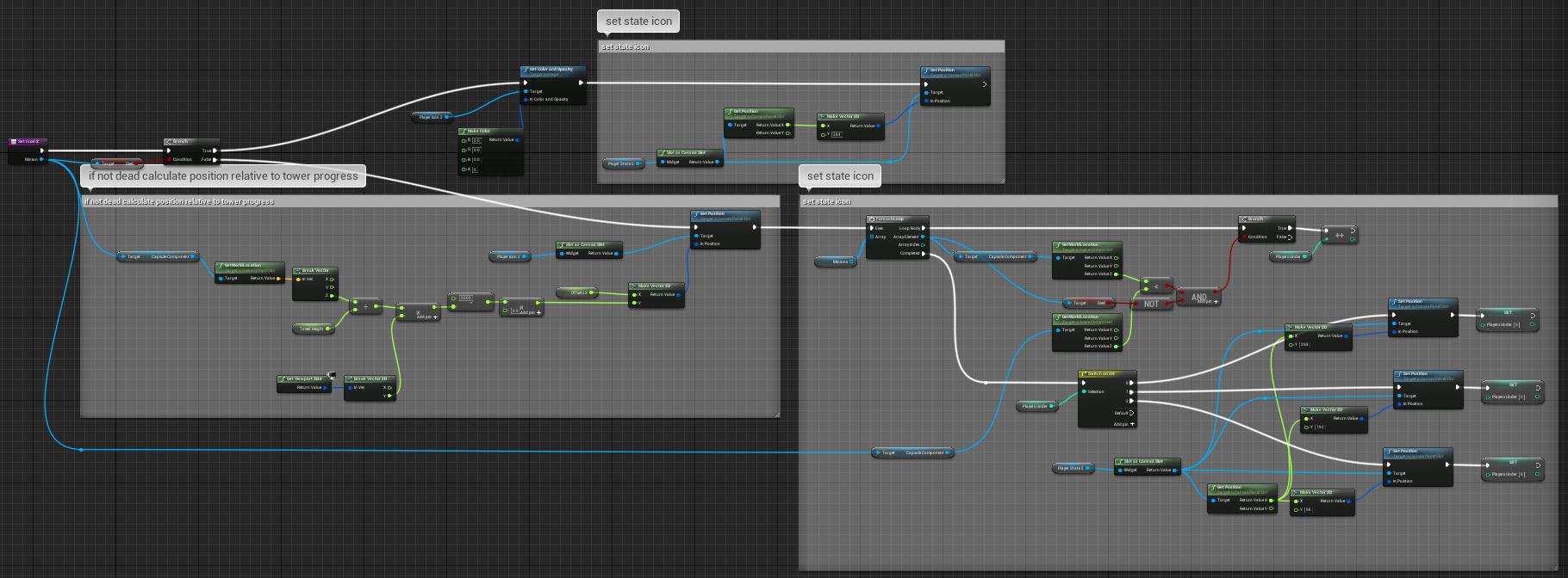
But by far the biggest task i got done this week was a functioning UI, it has two elements: on the left side each player can see their progress on the tower and on the right side we can see the players ranked in height and who is currently the overlord.
Overall very happy with my work, got everything to work properly (maybe the UI hasn't been stress tested enough to be 100% sure of that) and loved how I made my blueprints clean and readable. I used to be a little condescending about blueprints but the more I'm working with them the more I've come to appreciate them next to code.
Get [Group 8] Sacrifumble
[Group 8] Sacrifumble
Platformer mayhem with a spin
| Status | Released |
| Authors | PaulienCasteleyn, Robin Strubbe, MaximiliaanMaene, FlorianGaeremynck, yannickM |
| Genre | Platformer |
| Tags | Arcade, aztec, cartoony, Colorful, Controller, Local Co-Op, Local multiplayer, Skeletons, suspense |
| Languages | English |
More posts
- All good things come to an endJun 04, 2018
- Week12: The finish lineMay 23, 2018
- Week11: Make it look shinyMay 16, 2018
- Week 9: Prepare for take-offApr 24, 2018
- Week 8: Easter EggsApr 17, 2018
- Week 7: Game with a spinMar 27, 2018
- Week 6: Clean slate and cleaner teamMar 20, 2018
- Week 5: finishing up prototype and preparing HacknPlanMar 14, 2018
- Week 4: prototyping and 3D art shenanigansMar 06, 2018
![[Group 8] Sacrifumble](https://img.itch.zone/aW1nLzEyNzU4NDYucG5n/original/AwVoOT.png)
Leave a comment
Log in with itch.io to leave a comment.